FIN-X - Designing Meaningful Explanations
AI is playing an increasingly important role in the financial sector, helping institutions make faster, data-driven decisions in areas such as credit assessment and fraud detection. These are complex, high-impact cases where patterns in data aren’t always obvious to the human eye. AI models are capable of uncovering these patterns across vast datasets, supporting teams in reducing risk and improving operational efficiency.
In the research project FIN-X, our focus is not just on what the AI model can do—but on how it supports the person using it. We specifically investigate the role of the internal user: the risk analyst, claims handler, or credit officer who interacts with the model’s output and must make a final decision. Understanding how these professionals interpret explanations, and what they need to trust and act on them, is central to our research.
While these models often perform well from a technical standpoint, the way their results are presented still creates friction. Key reasoning and data are often hidden behind scores or icons, making it hard for users to judge the reliability of the outcome—or to confidently explain it to others.
To address this, we collaborated with Dutch financial institutions to explore how AI-generated explanations can be improved. We tested our designs on two relevant use cases: detecting potential car insurance fraud and assessing business credit applications. These provided concrete scenarios to understand different user needs and tailor our interface solutions accordingly.
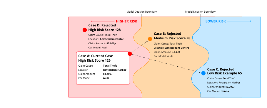
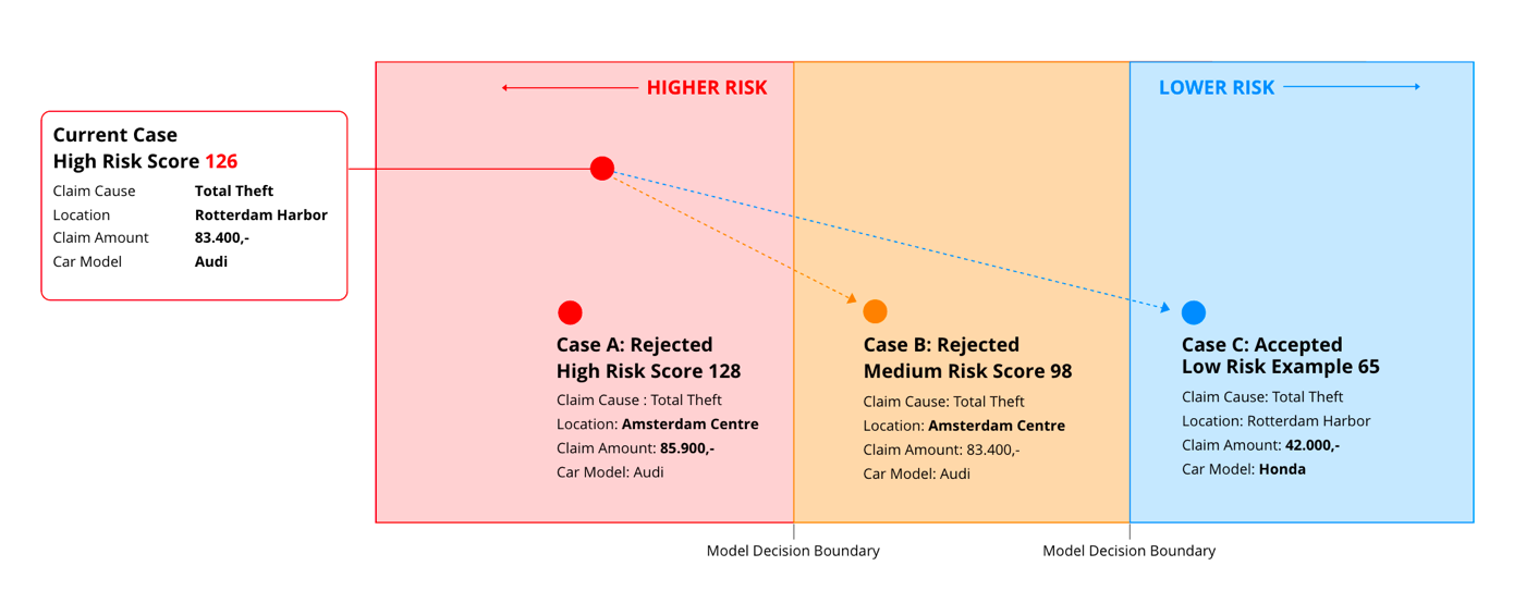
The final designs — available on the Prototypes page — are based on a fictional but realistic car insurance case, used to evaluate explanation formats in a controlled setting. Through repeated testing and iteration, we developed a set of practical strategies for more user-centered and transparent AI systems.
Below, we highlight four design insights that helped improve how explanations are communicated, based on our applied research and interface work in the field.
1. Use Neutral Colors Thoughtfully
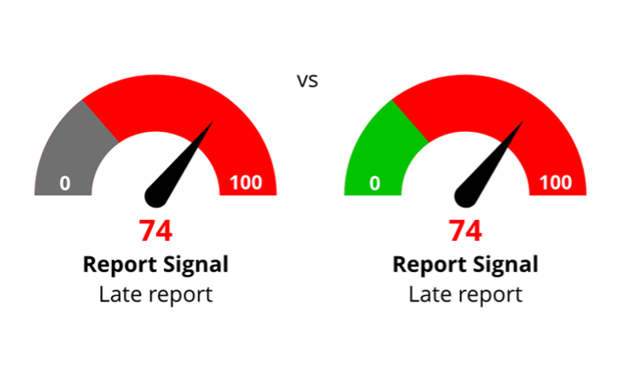
Red is often perceived as negative, green as positive. That works in many cases—but when you're dealing with approval scores or risk levels, it’s not always that black-and-white. In our designs, we used sky blue and gray as neutral colors for values that weren’t inherently “good” or “bad.” This helped prevent users from misreading scores as favorable just because they were low.
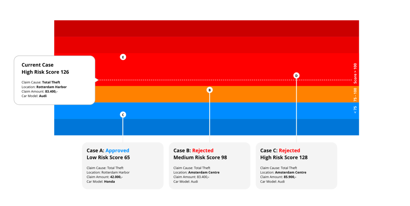
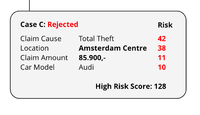
Many AI interfaces reduce explanations to a single number or icon. But what’s behind that score? Without context, users struggle to trust what they see. We found that showing contributing factors, comparisons, and optional details made a huge difference.

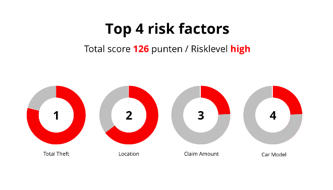
It’s tempting to include every bit of data, but clarity comes from restraint. We prioritized visuals that quickly communicated proportion, ranking, or importance. Users should understand the message without needing to read every number.

Realism in UI is not always helpful. What matters more is a clear structure that users can follow quickly. We designed layouts with alignment, consistent spacing, and visual contrast to support scanning from top-left to bottom-right—how most people naturally read.
Conclusion
Designing for explainable AI means more than visualizing model output—it’s about creating interfaces that users can understand, trust, and learn from. Through careful use of color, context, structure, and clarity, we can make black-box systems more human. For designers and developers working on XAI systems, these lessons offer a practical path forward.